Elm City FC
A soccer identity built entirely from New Haven.
Role
Brand & Identity Design
Tools
Illustrator, Photoshop
Type
Concept Project
Year
2026
The Concept
Elm City FC is a fictional professional soccer club for New Haven, Connecticut. I designed the full identity: crest, color, type, three kits, and brand patterns. Every element comes from the city’s real history. The goal was to not to bring soccer to New Haven but bring New Haven to soccer.
The Crest
An elm tree sits at the center for the nickname, “The Sound,” waves run along the base for the harbor, and EST. 1638 marks the founding year and the year the nine-square plan was drawn. Every mark on the badge points back to the city.
I kept the detail minimal on purpose. The crest stays clean so it reads at any size, from a stitched jersey crest to a small app icon.
The New Haven Story
New Haven is known as the Elm City, named for the elms planted along its streets and around its central common. Founded in 1638, it’s widely considered the first planned city in America, laid out as a grid of nine squares with a public Green at its center.
Every part of this identity pulls from that history. The elm tree is the root of the city’s nickname. The wave mark is Long Island Sound, the harbor New Haven was built on. The nine-square pattern is the original 1638 city grid. And the colors carry it through: lime for the elms, navy for the Sound, and white for the Green.
Color
Three colors, each tied to a piece of the city.
#B6FF1A
Lime Green
The elms. The trees that gave New Haven its name. Pushed electric for energy and growth.
#11203D
Navy
The Sound. The deep water and the working harbor the city was built on.
#FFFFFF
White
The Green. New Haven’s central common since 1638, standing for shared ground and unity.
The Kits
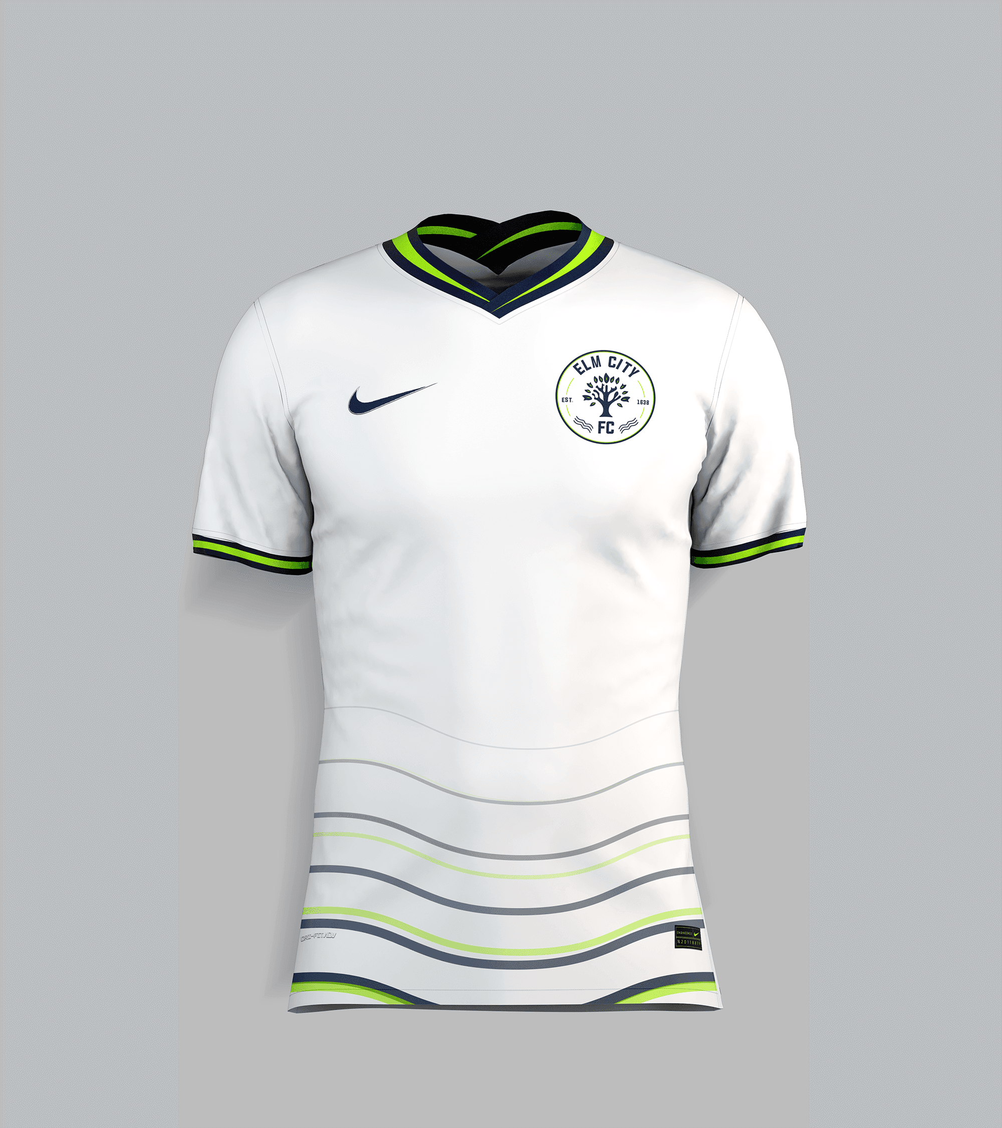
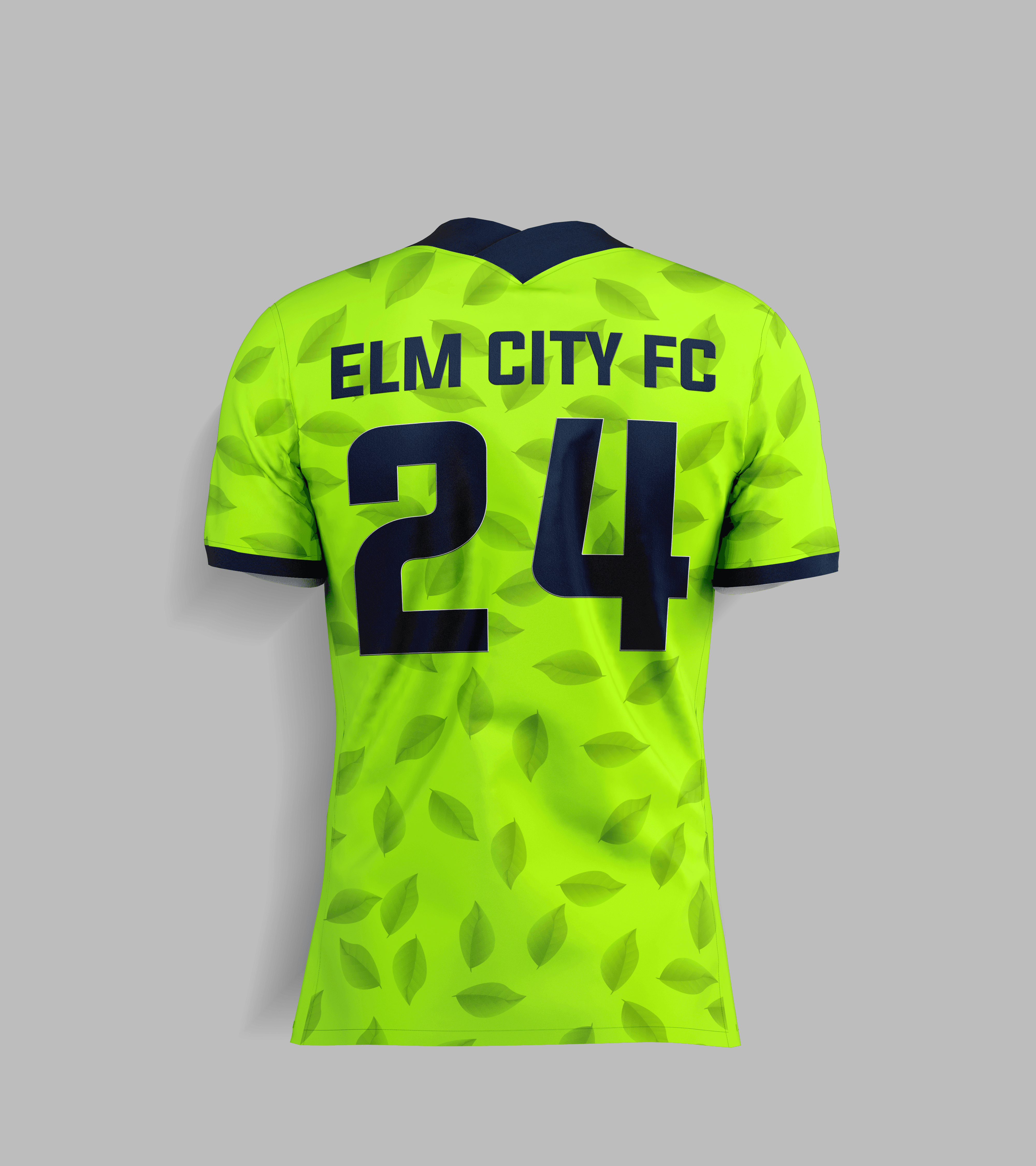
Three kits, each carrying a different part of the city. Home: navy with lime accents, the nine-square grid woven faintly into the fabric. Away: white with navy and lime, “The Sound” waves running along the hem. Third: full electric lime with navy detail, a tonal elm-leaf scatter across the body.




Patterns
Three brand patterns extend the story past the logo. A tonal elm-leaf scatter, a blended wave set drawn from “The Sound,” and the nine-square grid taken from the 1638 city plan. Each one carries a piece of New Haven into the kits, the matchday graphics, and the print work.


The Matchday System
A consistent social system built on the brand, ready for gameday. Same crest placement and type treatment across all three, one pattern per post, lime as the accent and never the background.

Matchday announcement (1:1)

Matchday announcement (1:1)
Other projects